
Tracker operates within a complex ecosystem of vehicle monitoring, security, and fleet management products. Multiple teams were building independently across web and mobile, resulting in fragmented user experiences and inconsistent UI patterns.
The goal was to create a unified design system for web that could scale across products while aligning closely with the mobile app experience.
Senior Product Designer
Tracker SA
Cross-functional teams across product, engineering, and business
Tracker is a leading vehicle monitoring and telematics company in South Africa, offering products across stolen vehicle recovery, fleet management, and consumer tracking. Over time, multiple digital products were developed by independent teams across web and mobile, each responding to different business needs and user groups.
The objective was to design and implement a unified design system for the web platform that could establish consistency across multiple products and teams, improve usability within complex, data-driven interfaces and align web experiences with mobile app patterns where appropriate.
The Tracker Design System created a shared foundation across teams, significantly improving consistency, collaboration, and speed of delivery. It enabled a more cohesive cross-platform experience while setting the groundwork for scalable, system-driven product development.
As UI Lead and Product Designer, I led the end-to-end design system initiative across multiple cross-functional teams, ensuring alignment between design, engineering, and product.
Design System Strategy
Audit & Rationalisation
Cross-Functional Collaboration
Component & Pattern Design
Design + Development Alignment
Governance & Adoption
Tools used
1. Audit & Discovery
2. Define Foundations
3. Alignment & Workshops
4. System Design
5. Build & Collaborate
6. Document & Share
7. Maintain & Improve
Methods used
Different product teams were solving similar problems in different ways, leading to:
This lack of cohesion made it harder to scale products efficiently and maintain a strong, recognizable product experience.
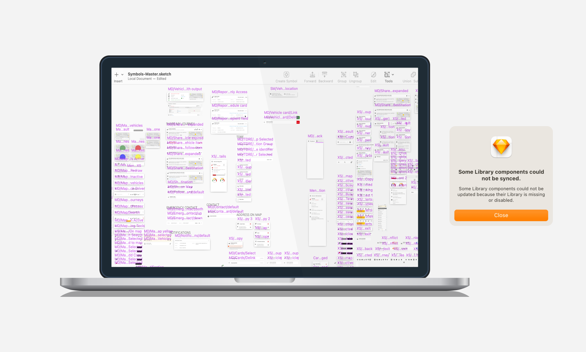
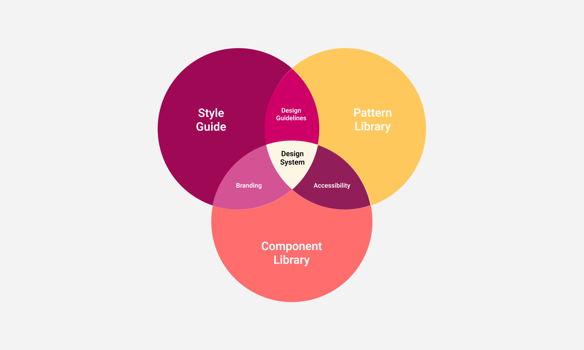
I led the design system initiative across multiple teams, balancing immediate product needs with long-term scalability.
Key activities included:
Research focused on understanding the current product landscape, team workflows, and user experience across web and mobile. The aim was to identify gaps, inconsistencies, and opportunities to inform the design system.
What I did
How it informed the work
These insights helped prioritise what to standardise first, shaped the system foundations, and ensured the design system solved real team and user problems rather than just creating UI consistency.
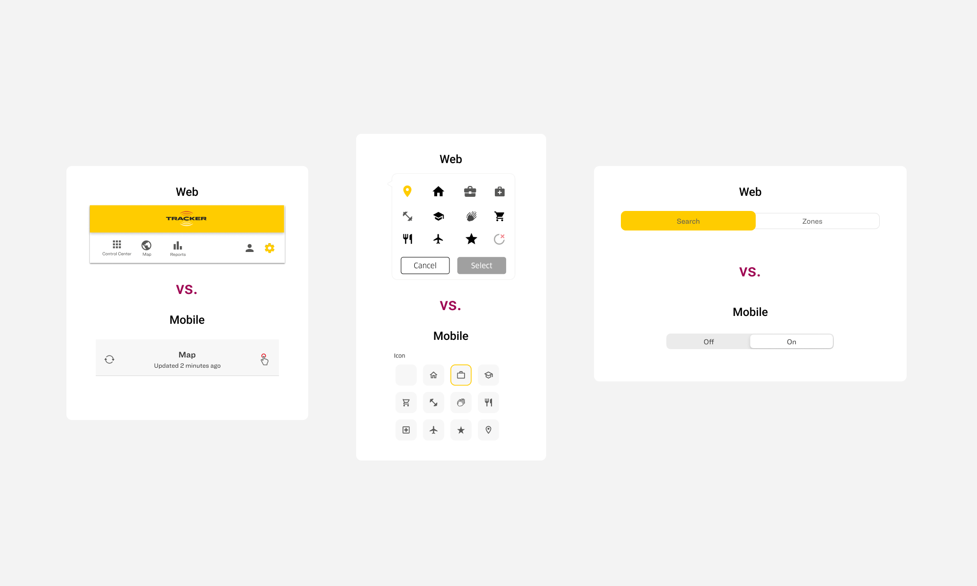
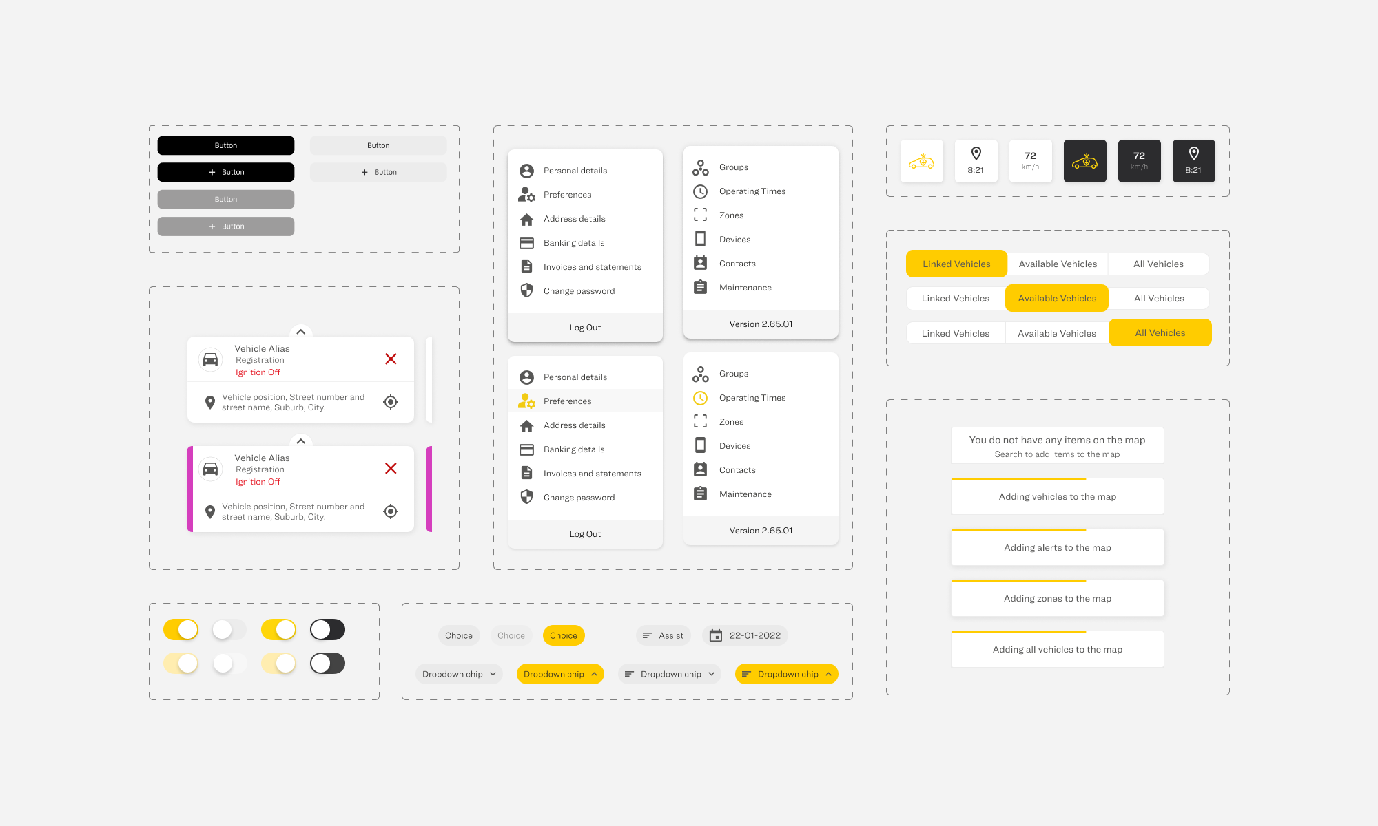
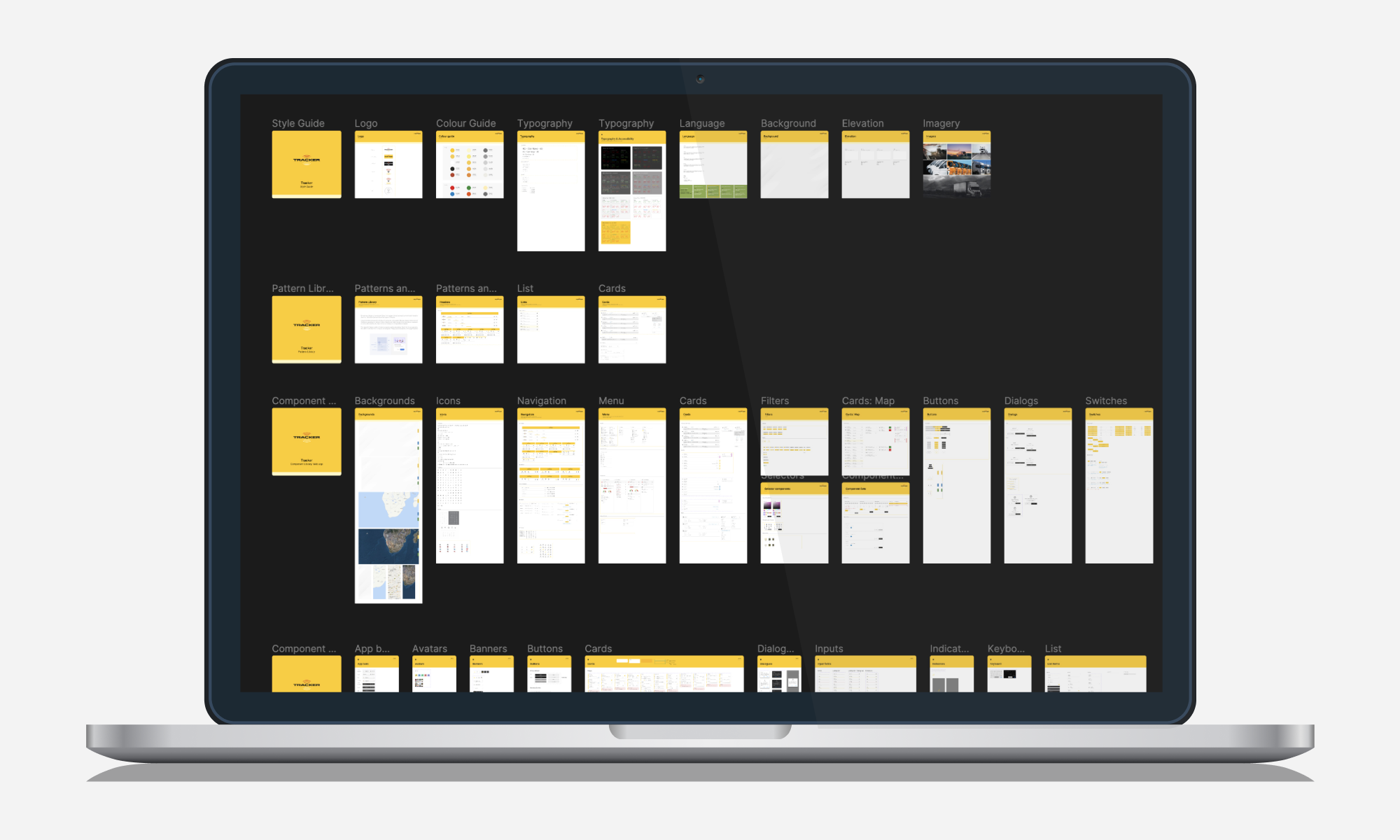
The Tracker Design System became a central source of truth for product teams. It established clear foundations including typography, colour, spacing, and layout, with accessibility built in from the start.
A reusable component library was created for web, designed to stay aligned with mobile patterns where possible. Close collaboration with engineering ensured components were implemented effectively, supported by clear documentation for both designers and developers.
The system was built to scale across multiple products, with the flexibility to adapt to different use cases over time.
The design system was rolled out incrementally across products, starting with core foundations and high-use components.
I worked closely with engineering teams to translate designs into reusable, production-ready components, ensuring consistency between design and build. Components were integrated into live products as part of ongoing sprints, allowing teams to adopt the system without slowing delivery.
Clear documentation and guidelines supported adoption, while regular check-ins and feedback loops helped refine the system in real use. This approach ensured a smooth implementation, with the system becoming part of everyday workflows rather than a separate layer.
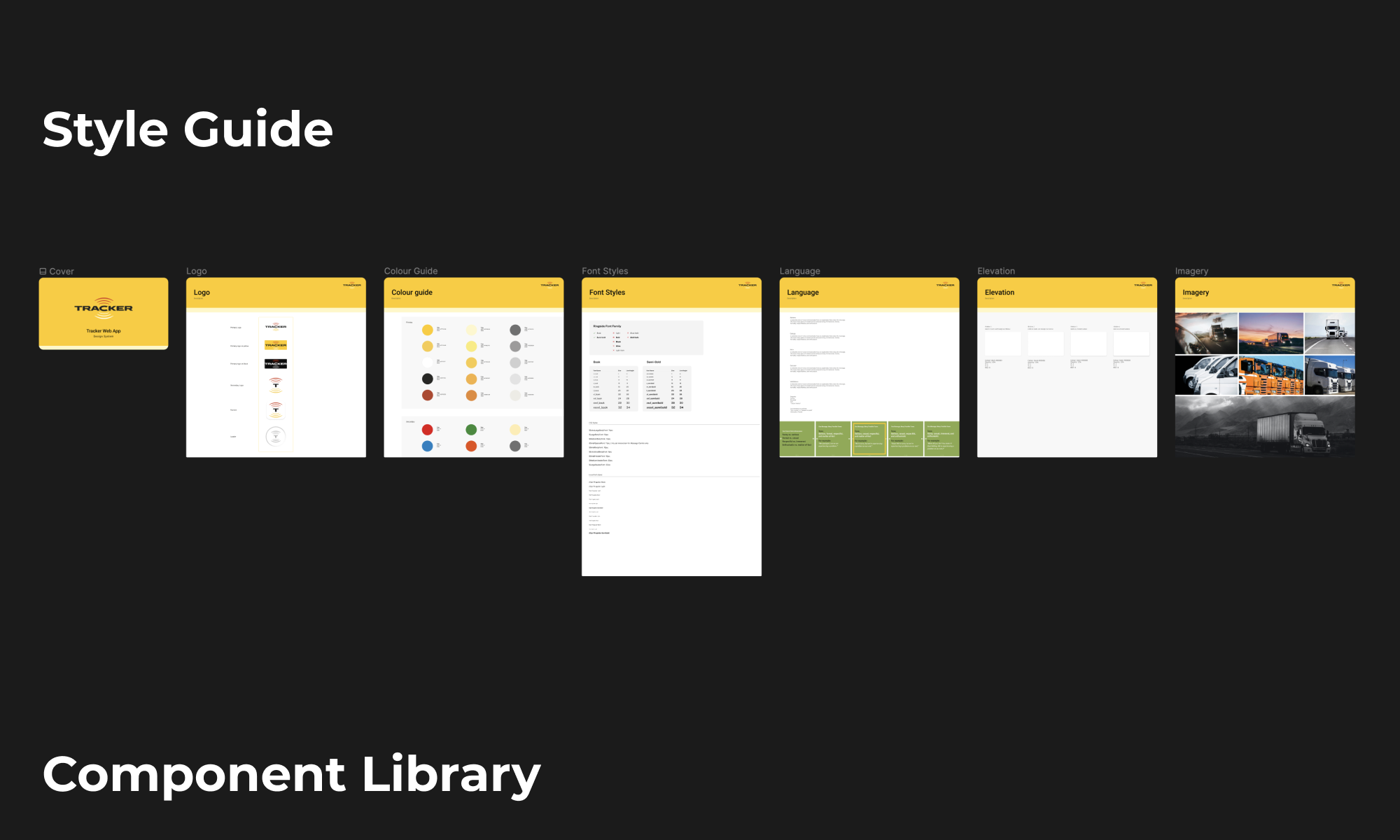
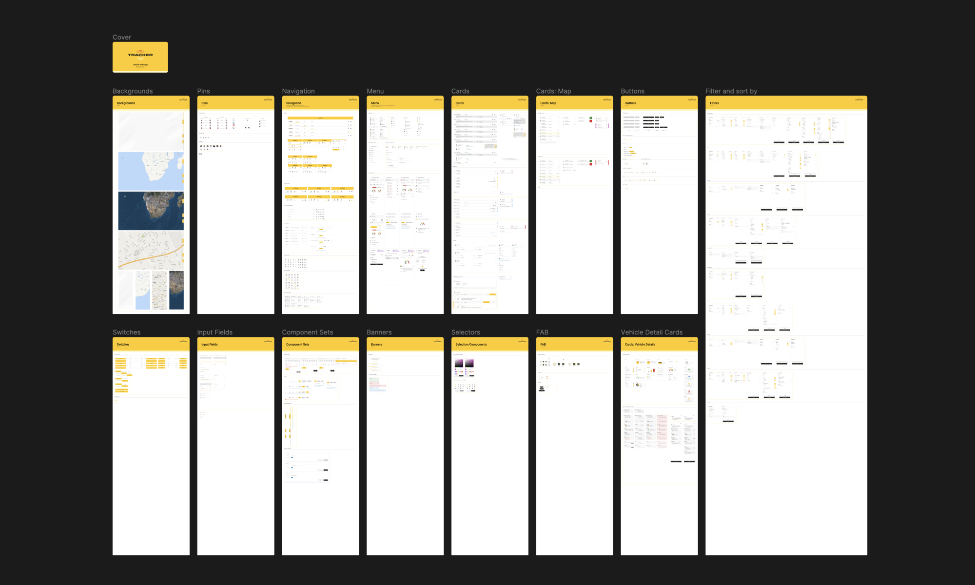
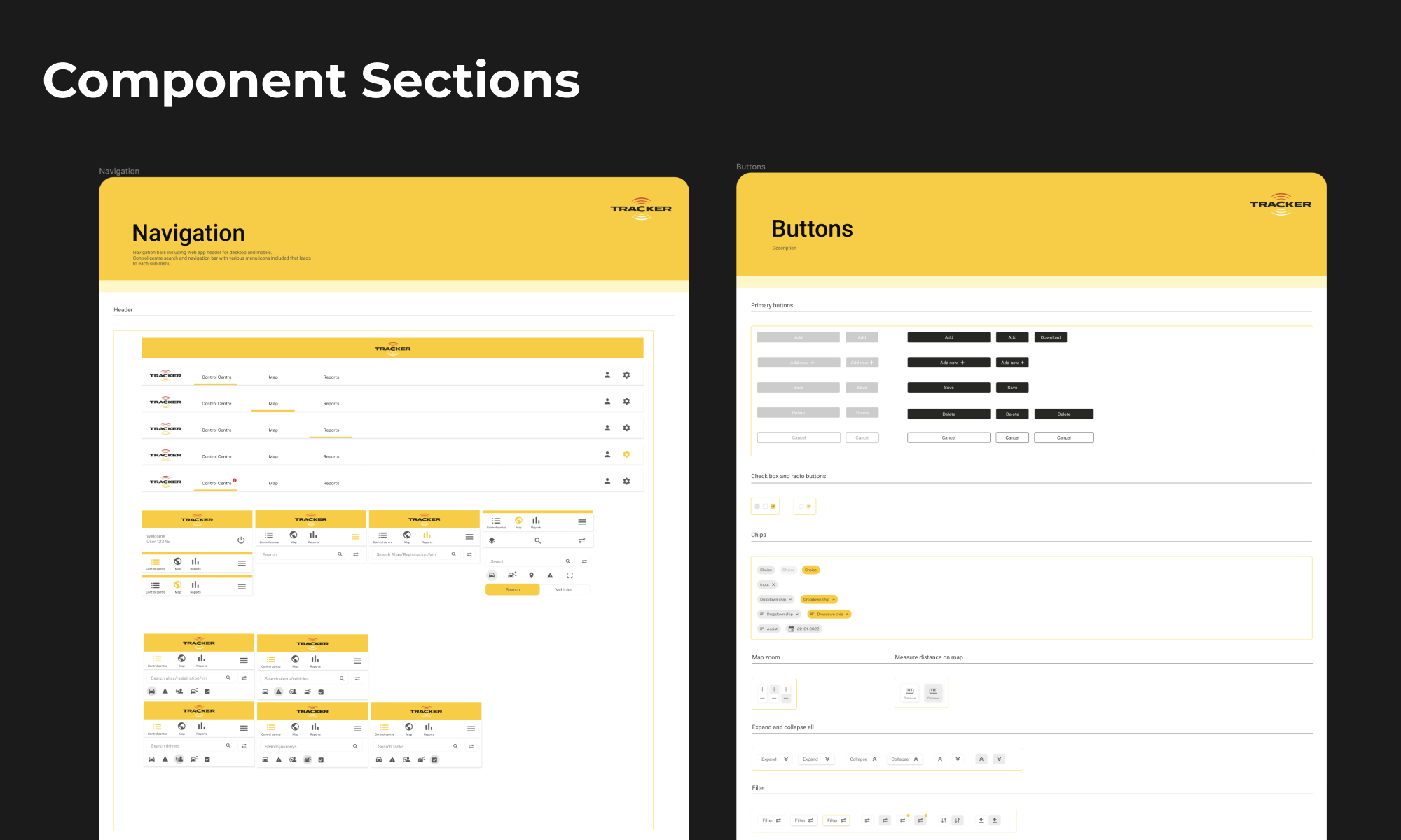
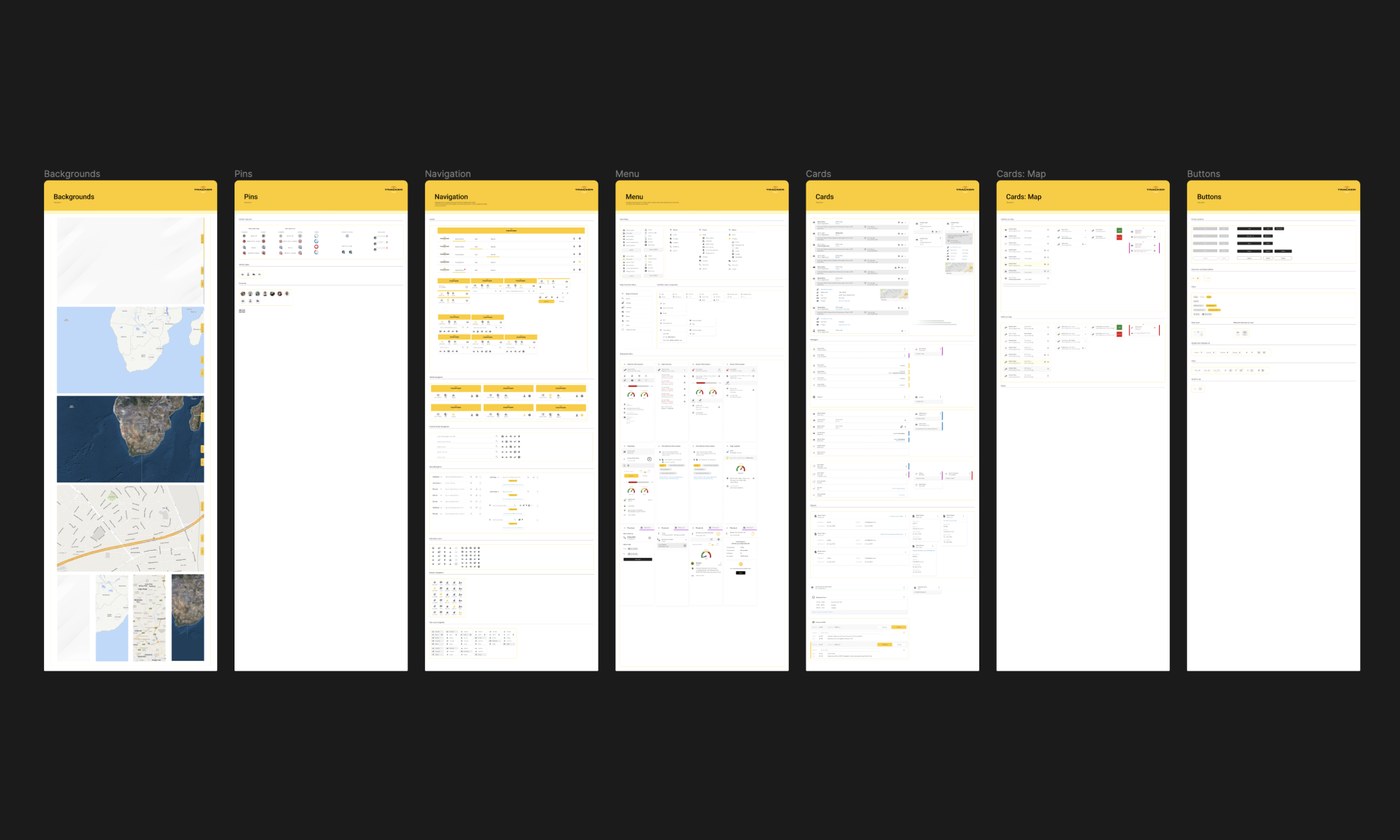
The design system significantly improved both team efficiency and product consistency. It led to faster design and development cycles, reduced duplication across teams, and created a more consistent experience across web and mobile. Collaboration between teams also improved, with clearer alignment and shared ways of working. For users, this resulted in more intuitive and predictable interfaces, along with improved usability across both web and app experiences.
Strong collaboration across design, product, and engineering made a big difference. Early alignment on principles and priorities helped teams move in the same direction, and rolling the system out gradually made it easier to adopt without slowing delivery.
Aligning multiple teams with different goals and timelines was not always easy. There were trade-offs between speed and maintaining system quality, and getting consistent adoption across teams took time and ongoing support.
I would invest earlier in governance and clearer contribution guidelines to reduce confusion as the system grew. I would also involve engineering even earlier in defining foundations to strengthen alignment from the start.